Octor Brand Identity Transformation


The Objective
Octor needed a visual identity that reflected what it had always been at its core: a B2B medtech company operating with precision, credibility, and enterprise-level seriousness. The existing brand felt too casual and too generic to support that positioning in healthcare and technology contexts.
The Challenge
The old identity created several mismatches. The orange palette and lowercase type leaned consumer-facing rather than professional; the globe icon was visually vague, and the rounded letterforms lacked the authority expected in medtech. It also did not scale well across digital surfaces, product UI, or formal collateral.

THE SYNERGOS APPROACH

We approached the rebrand as a structural rethink rather than a cosmetic refresh. The goal was to create a mark that could speak to both the medical and technology sides of the business, while also standing confidently on its own across print, digital, and app environments.We took a scalpel to the brand's identity before stitching together assets that made sense in the real world. The result was visually appropriate yet distinctively its own character.
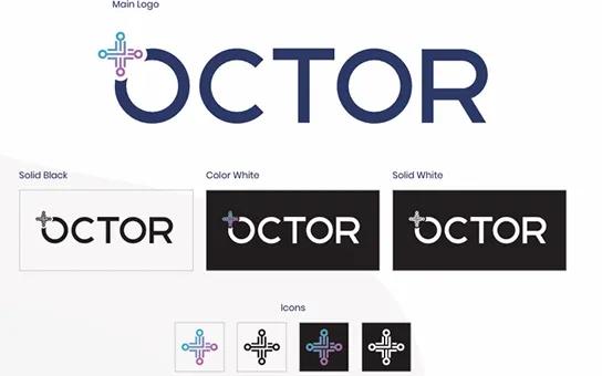
The new identity introduced a circuit-node cross that visually merged two ideas at once: medicine and technology. The icon was built to function independently, while also integrating into the wordmark as part of the “O,” creating a unified and memorable logomark. The palette moved to deep navy to signal trust, authority, and clinical precision, and the typography shifted to uppercase geometric forms for a stronger, more professional tone.
We began with a brand audit to understand where the old identity broke down across pitch decks, digital touchpoints, and printed materials. From there, we refined the mark across light and dark backgrounds, tested legibility at multiple sizes, and developed a full brand package with colour tokens, usage guidance, and clearspace rules. The result was a system designed not just to look good, but to work consistently in real-world healthcare applications.
The Outcome
The rebrand gave Octor a visual identity that finally matched the sophistication of its product and the seriousness of its sector. The new mark resonated immediately with enterprise healthcare stakeholders, and the standalone icon proved highly versatile across app icons, exhibition materials, and digital touchpoints, giving the brand a more consistent and professional presence wherever it appeared.


About Octor
Octor is a B2B medtech company focused on the intersection of medicine and technology. Its refreshed identity now reflects that positioning with clarity, confidence, and precision.