How Synergos Transformed Kia's Employee Newsletter Into a Premium Magazine

The Objective
To transform Kia's monthly employee newsletter from a functional but forgettable format into a premium, well-designed magazine that people actually look forward to reading, in both English and Telugu.
The Synergos Approach

Identified the core problem with the existing format: a double-sided A3 sheet with no consistent hierarchy, inconsistent layouts, and an awkward bilingual structure that made navigation feel like a chore.
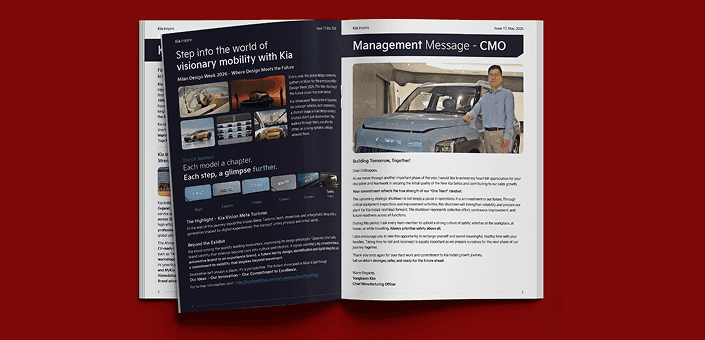
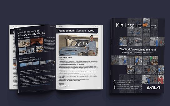
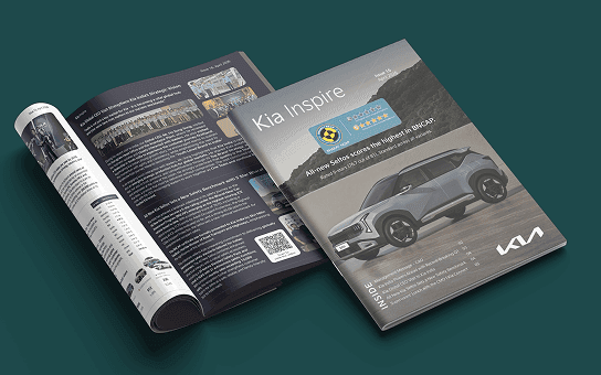
Proposed a shift to a magazine-style editorial format with clear design principles: a maximum of two articles per page, a consistent colour palette and typography system, and strong visual hierarchy throughout.
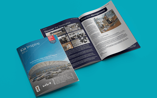
Designed a 20-page magazine with an innovative bilingual structure: the first 10 pages carry the English content, and flipping the magazine over reveals a complete Telugu section with its own front cover, giving each language equal presence and dignity rather than relegating one to the back.
Applied consistent layout grids, spacing, photography treatment, and editorial styling across every issue to create a unified, recognisable brand feel from month to month.
The Outcome
The redesigned publication landed exactly as what it was intended: a magazine worth picking up. Readers at Kia responded enthusiastically from the first issue, and it continues to be eagerly awaited each month, a direct reflection of how far the reading experience had travelled from its A3 origins. 20-Page Magazine
20-Page Magazine
Bilingual with Two Front Covers
From Newsletter to a Publication People Look Forward To
About KIA India
Kia India is one of the fastest-growing automotive brands in the country, known for its design-forward vehicles and strong focus on customer and employee experience.